Since the Perfect Tile System launched 5 years ago, many improvements have been made. And 4.26 brings some pretty fascinating additions and changes!
DTAAPOM
My blog post regarding how to implement DTAA to improve POM rendering blew up. It is now integrated with the Perfect Tile System! All Parallax Occlusion Materials now have DTAA added to improve quality and performance, and the sample counts have been re-adjusted. The DTAA material function has also been included in the material functions category. Check it out!
Please note Temporal Anti-Aliasing is required for this feature to function. Instead of sharp artifacts, DTAA simply appears blurry when the sample count is too low.
Anisotropy
Now that 4.26 made proper anisotropy part of the engine, all anisotropic materials now support the engine's anisotropy by default! Dithered Temporal Anisotropy introduced more artifacts the further the effect was pushed, and took very long to resolve - these issues do not occur in the engine's anisotropic solution.
Please note anisotropy is not supported on any subsurface materials.
Iridescence improvements
When iridescence made a splash, the initial integration was simple, but effective. Now, controls have been added to apply random variance per-tile. And the iridescent colors are now multiplied instead of lerped, so the blending is more appropriate.
Potential future improvements include more accurate lighting with anisotropy (requires an accurate anisotropic specular model), and support for anisotropic maps.
I think it's no surprise why so few games take a legitimate stab at trying to replicate real fur on characters. Rendering millions of individual fur strands are impractical, and keeping things basic tends to yield the most appealing results. The Billie Bust Up example has the most appeal, but makes no attempt to capture texture. Similar for the Poly Art example. Epic's own Fennix from Fortnite balances appeal and resolve, but mostly uses medium-sized polygons to capture tufts of fur rather than worrying about texture. FostAPK tried a more realistic texture on a flat model, but it becomes quite obvious the fur is fake and the appeal goes down. The most realistic approaches use shells to make an attempt at generating the appearance of strands of fur leaving the model, but the results are often poor quality and unappealing.
Murnatan Aliens - AAAGames Designed by Tomáš Drahoňovský Using Neoglyphic's Neofur plugin Developed by Carlos Montero et.al.
Of course, it's no secret the Neofur plugin by Neoglyphic Entertainment had the most fully resolved fur implementation in UE4. The fur was fully interactable on mobile, supporting plenty of grooming features and color options (including base-to-tip coloring on the strands), and it appears to support actual shells so the fur can have appropriate silhouettes. The character design is in the eye of the beholder, but the fur here is some of the most technically stunning ever accomplished, within the engine or otherwise.
Unfortunately, the group disbanded, the plugin stopped being supported, and it was pulled from the Marketplace years ago.
I set out to make my own fur solution. Strands are still too expensive and experimental, and shells require tampering with custom shader scripts and might be beyond my comprehension... so it had to be based on POM.
Groom POM 171 total pixel shader instructions 2-16 steps DTAA, 2.5-20 step average
Not bad?
This result is quite simple, it's just a combination of a few very good decisions. The heightfield texture is just a bunch of spots in random locations with a bit of distance between them.
Pros
Beautiful furry and fuzzy look with clear layering
Easy drag-and-drop results
Note - Direction relies on texture coordinate and UVs, which require careful consideration, but it can be dropped on any mesh for instant results without plugins.
Direction and length can be easily controlled by the artist
Can also be easily expanded with constants and custom flowmap/groom textures, even panning textures to simulate wind
Optimization is superb
Steps are reduced evenly across the surface with minimal distortion
DTAA gives impressive results with blurring/fuzziness as an appealing artifact for lower samples
Very low min steps (2-3) looks very good
16 max steps looks satisfying. Diminishing returns with higher samples.
Not much more expensive than other, less interesting surfaces
Flow direction can be used for calculating tangents for anisotropy in shader (will experiment with this later)
Limitations
No exposed fur on silhouettes
Experiments show silhouettes are possible, but tend to leave gaping holes in the mesh when using Fresnel. It's possible to use 2 copies of the mesh, one solid with inward vertex displacement, another with masked translucency to provide silhouettes without disappearing completely. This would be more complicated to rig and animate properly. It would be easier to analytically calculate a proper solid zone in shader. Maybe with sobel edge detection? Custom depth? This needs more experimentation.
Distortion around the surface
Persistent issue with POM
Sharp hairline details do not look as good as softer fur - I.E. shiny wet black dog
Such examples should be textured flat on the model with anisotropy anyways.
Flow Map is actually a 3-Vector input. XY/RG controls the direction (in texture space), while Z/B controls the length.
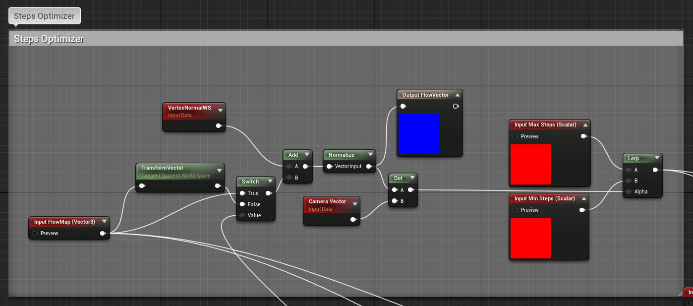
Simply adding a 2-vector flow map or constant after the View Trace portion inside POM will allow you to change the direction of the fur. But because of the direction, Fresnel no longer works properly for sample optimization. I got rid of the Fresnel optimizer and substituted my own.
Visualization of Steps Optimizer in Groom POM White = max steps, Black = min Note more samples are used bottom left of mesh where strands appear longer. This method respects flow direction and strand length.
Steps Optimizer - 9 extra instructions vs. unoptimized
This optimizer converts the flow map into normals and compares to the camera angle. Short fibers, and fibers facing toward the camera receive less samples than long fibers facing perpendicular. The lack of a clamp after the dot term makes it possible for the samples to be increased beyond max if the direction is elongated (XY flow map determines direction across the surface, Z determines length). The added benefit of using the optimizer is a more consistent look across the surface - samples don't just build up in one part of the mesh more than the other.
Final look - Shadow, AO, and Fresnel in Cloth Shader
This is what completes the final look. The heightmap is used to generate a "shadow" from the base of the hairs pointing outward, making individual strands stand out. AO emphasizes this shading in the shadows. Higher roughness and the Fresnel term gives the fur a brighter sheen at grazing angles according to the light source, where light would be picked up by the fur.
It is possible to enhance this method further with a more robust setup capable of handling silhouettes. The flow direction should also be the basis for calculating tangents for anisotropy. But as it stands, this fur looks soft, luscious, and beautiful, it's extremely well optimized, and it's extremely easy for artists to work with and make changes.
Happy Fox by Ma-zach This is not UE4. But it could be UE5...
POM is expensive - NOT! Here's an easy way to maximize POM quality in UE4 without much extra rendering cost: use Dither Temporal AA to increase the number of samples over time.
Benefits
Smoother and fuller results, eliminate stair-stepping
MUCH higher quality
Ability to handle very low steps for major performance reduction
Not much extra instructions necessary
Drawbacks
Blurriness instead of stairstepping/pixel swimming artifacts
Very low steps yields blurrier results (1-3 samples... actually surprised it can be pushed that far)
12 extra pixel shader instructions
Requires TXAA
:| Don't let that stop you!
Future Improvements
(POM improvement) - Support silhouettes
The Dither Temporal AA node works by adding screenspace noise to randomize samples and resolve over time. We can randomly sample the parts in-between steps and resolve to a final smooth blend using much fewer steps than what would be required without DTAA. Since the Temporal AA samples and convergence are already calculated and stored in the g-buffer, this material piggybacks off of existing systems.
TLDR: Instead of harsh cutoffs, DTAA POM resolves fully over time. The result is MUCH higher quality with minimal tradeoffs.
I have noticed discussion of this technique in forums, but it was always implemented improperly: Lerping Max Steps down to 0 with Dither Temporal AA in alpha. This will simply cut your average Steps in half and looks very rough. You can multiply this by 2 to bring your step average back to normal, but the result is still quite rough. The dither ranges 0:1 and resolves between double your step count and absolutely no steps at all!
Instead, I tried to find methods that limited the range to produce better results. We only need to resolve in-between steps, so randomizing (1/2x):(2x) gives the richest and cleanest result.
DTAA POM - Quality Function - Material Setup
I attempted other methods, including those of forumgoers, but only the quality function is recommended.
Comparison shots below.
More steps are always going to be required to reduce blurriness. The dither is very powerful, so even extreme POM examples look fine at 8 or 10 max samples. You should place the same quality function for near samples as well.
Finally, here's a nice wow shot: the sand in my test project, Jake, used to use tessellation, but that proved to be too expensive. No amount of optimizing made it sane, not even for extremely high resolutions. I replaced it all with POM, and the results were still very iffy with the steps ranging 4-16. Now, it looks beautiful even with a range of 1-12. In this image, the height of the parallax was doubled, and the samples reduced to 3-10 (in practice averaged 3.75-12.5).
Flat Lighting
DTAA POM - 3 Min Steps, 10 Max Steps - Quality Function
Yes, POM on landscape with negligible performance cost.
I tried caustics before, but this time I wanted to experiment with something I'd never done - diffraction. More specifically, how light splits at angles producing gorgeous colors. UE4, unfortunately, has one major limitation on this for light functions:
Only single channel can be used for light, single color
Possible to use 3 light functions (RGB), but shadows must be calculated for all 3
Decals also have other issues:
Applied to backfaces (does not respect shadows or occlusion at all)
Can't access G-buffer or surface normals (no way to assign proper occlusion terms or physical behavior with different materials)
And hard-baking into materials presents its own challenges as well:
Caustics material function required for each material touching underwater (including character parts and anything thrown underwater).
Difficult to iterate (changing material function affects many shaders)
This method appears to be the easiest solution to work while also producing some of the best results.
Pros:
Full access to G-buffer and world position, for proper lighting, normals, and effects
Full RGB color
PBR custom solution that respects roughness, metallic, and specular terms with Lambert diffuse and GGX Specular
Appropriate diffraction - Red bands appear further from the light source than green or blue
Appropriate diffusion - Caustics blur deeper into the water.
Quality - Uses a single uncompressed grayscale caustics texture and normal map. Looks perfect.
Performance - 0.3 ms on RTX 2060 Super at 1440p. Cost scales with resolution.
Cons:
Does not respect shadows - Without access to UE4's calculated shadows, the only way to create a shadow solution is to run on top of the engine solutions
Does not respect POM depth - Same is true for all but the hard-coded material method
Limited PBR access - While full access to the G-buffer is available, coding proper subsurface terms prove challenging without custom code and taking a heavy performance hit
Shines through translucent objects - Possible to code out, but takes a heavier performance hit
This is the full PPM shader, which I'm not using all of.
The light direction shear - this is what makes the texture look like it's being applied from the light source. We need the inverse XY vector from the light source, multiplied and added to the different world position XYZ channels in this manner. Instead of using a standard world position, using this for the texture mapping gives us the planar-mapped look.
Every good caustics system has distortion and panning. This allows the caustics to appear shimmering in motion. The shear from above is plugged into the mask, then scaled for both the wavy distortion normals and the caustics textures. Getting the scaling and numbers right is tricky, but the goal is to get as much resonance between the distortion and caustics as possible: the gaps in the caustics should get filled with light as the texture distorts. The shimmering here looks extremely good in motion.
The world position depth is used for a variety of calculations - cutoff between underwater and the surface, the blurring of caustics deeper in the water, etc. The interesting calculation here is a simple factoring of the light vector into the separations - this allows us to push the red band further from the light source, and the blue closest. These two are multiplied.
The actual diffraction of the caustics occurs here - All three textures are actually the same uncompressed grayscale caustics texture, but each one is shifted in a certain way based off of the position of the light source and the depth calculated earlier. This shifting causes red and blue and sometimes green bands to appear. This gives the caustics its colors and behaves more accurately than other systems. The multiply 1 chain can be used to scale the whole system.
All the textures are set to use a specific mip level based on the depth. This is what causes the blurring deeper into the waters. Additionally, the caustics texture is set to Blur setting 1 so we can have the highest quality blur and most consistent blending possible.
We add this to the terms above.
Here's where the PBR magic happens - We have the light vector, and with the G-buffer we have most of the same tools given to the engine's shaders to create a physically based system that respects the color of the sunlight, color of surfaces, roughness, metallic, and specular proprerties. As the surface gets more metalic, the color of the caustics light begins to take on the base color of that surface. The Lighting model function includes lambert diffuse, and various specular functions, but I use UE4's GGX function in a custom node to get bright highlights. This is the aspect a lot of people miss, and they end up making caustics that look stickered-on. This system tries to recreate UE4's render pipeline as much as possible.
And the results absolutely speak for themselves.
Note - To get bloom, TXAA, color grading, etc, in the material set > Post Process Material > Blendable Location > Before Tonemapper.
Jake is my personal test project to experiment with and proof various technical concepts. This mall is a sprawling effects extravaganza. Gonna work through the different concepts through buffers with you!
I love using Fresnel effects to achieve the "Super Mario Galaxy" look - rim lighting, and glossy reflections on rough, solid surfaces. But here, it's used to give a softer look to the lighting and break away from the Lambert diffuse we're so used to. Rough surfaces are brighter on grazing angles, and this is what I try to mimic. Smooth, reflective surfaces aren't. You can see the green glass does get more green at grazing angles, though.
Roughness on clean surfaces should be uniform, otherwise it will look like the painter made a mistake, and patches will look shinier than others. Not much interesting going on here, except I did make sure the grout is not as reflective as the tile, otherwise the whole thing would look slick and weird.
Speaking of glass at grazing angles, I am getting that thick green glow by using a custom depth fade. It's very easy to see here. Combined with the Fresnel effect and the full metallic surface gives the glass its heavy "glass" look. Otherwise, it would just look like cheap acrylic.
The water also uses depth fade to drive a color ramp.
The tiles, bubbles, and even the stucco texture on the walls have parallax (bump offset) to get better depth. The sand even has parallax occlusion for very dramatic lumps. In VR, I imagine this would look amazing. The tiles even have a bit of random tilt in the normals to scatter the reflections.
The curved reflections in the glass on the right gives a neat space age look, and UE4's SSR does a pretty good job. But RTX would still resolve better around the bend. The water has an inclusive planar reflection: it's quite expensive (3ms at 1440p on an RTX 2060 Super, about 20% of the frame total), but it adds depth and drama to the environment in every shot. Using 3 sphere reflection captures to cover gaps, everything in this building has a reflection.
Of course, the many layers of translucency are quite expensive. Using simpler hard-coded reflections would be much cheaper (the columns could be better optimized), but for PC this is quite tame. In this game, users can adjust graphics settings and scale resolution to their needs. The floor is the most expensive portion of this whole game. I think it's worth it.
The lighting, unfortunately, was a huge tradeoff. Baking is impractical for an open world, so I opted for all dynamic with SSGI. Without SSGI you can see the light is rather harsh, especially when it fails to brighten the ceiling. It's hard to tell, but the sun is warmer and the skylight is cooler, providing some nice color contrast.
Here is the final image without any post process at all: no bloom, no lens flares, no color grading, etc. It looks rather hard and sharp, and quite even. This is good: it will give you more room to play with in post.
And finally, when it all comes together. SSGI lights up the ceiling a bit, but better GI would handle that much better. The bloom gives the light a strong presence and really brings the image to life, while hiding imperfections. I color grade with more reds in neutrals to make the cyan and blue really pop. There is so much interaction with the light and reflections in this image the colors just mix beautifully.
Nighttime shots hide the imperfections even more, and look quite stunning ;)
Did you ever think you'd have to support gamers running 1366 x 768? According to Steam's latest hardware survey, that's what 11% of gamers are running!
Graphics settings are a pretty big deal to make sure games run and look their best, but the nitty gritty of the detailed lists with tons of options are not exactly fun to make from scratch or navigate for the user. I hate having to keep going into this menu to see the results and go back: I wanted to make a simple, easy-to-use menu in Blueprints and UMG that just works well.
The game is paused for this menu, but everything updates live and you can see it right away. Everything saves on close and reloads properly on open. Colors and graphics are not final, but this layout and functions are pretty final.
Design
The menu does not feature too many options
Quality
The logic for quality settings took a while to figure out, but the solution turned out to be quite simple: use a macro to change quality levels. Clear all check marks on initial load, then use a chain of macros to set them according to the save state. The macro has to be smart enough to activate the right buttons using selections and generate the proper console command strings. String part is easy, (console command sg.PostProcess 3), but making sure all the buttons are set properly was rather difficult! UE4 changes button names when copy+pasting, so I recommend building the buttons first, and testing and verifying everything.
I don't have the LOD slider functioning properly yet, but I intend this to adjust LOD size ratios so higher LODs get used sooner and the landscape becomes less tessellated. Since temporal AA is required for SSR translucency and more expensive temporal values create more blurring artifacts with moving foliage/water, I just set it to something agreeable permanently.
That being said, the lowest foliage and shadow settings will turn those items off completely. I'd rather disable those buttons and make it obvious the feature is required.
Resolution
Things get a lot more interesting with the resolution. Epic really likes screen percentage, so the user can drag a slider freely from 50% - 100% the desktop resolution (Actually updated screen resolution by copying all global post process settings and only changing the resolution. There may be an easier method now...). Once the value is committed the system uses the desktop resolution and rounds to the nearest whole pixel on the Y axis. This ensures the sharpest image possible. The actual resolution is displayed up top and updates live. I also have buttons for predetermined common resolutions: though BP does not have access to properly changing both X and Y resolutions (and Epic really encourages percentages instead of setres), I still like the feeling of making a physical selection. It only uses Y values for calculations. When players see the buttons only drag the slider, they may be more inclined to just use the slider outright. Best of both worlds, and a great example of informing usability! Why don't more menus do this?
There is a method to my 5 common resolution choices:
HD
1280 x 720
921,600
HD+
1600 x 900
1,440,000
Full HD
1920 x 1080
2,073,600
QHD
2560 x 1440
3,686,400
4K
3840 x 2160
8,294,400
According to Steam's June 2019 hardware survey, 65% of users play at 1080 "full" HD, but a whopping 11% still play on 1366 x 768. Since this resolution doesn't divide down nicely, I'll expect those gamers to use the slider. 2560 x 1440 represents 5% of users, and the rest get less popular from there. 1600 x 900 is the most commonly used step between 720 and 1080 (3.2%), and I had to include 4K (1.6%) as the highest possible option.
Framerate
And finally, an option I don't see in any PC games: a framerate cap! At first glance it seems like a terrible idea, but games on consoles have been doing this since the dawn of time to fix erratic performance. Most 30f games can actually run faster at certain points, but overall the rate is too unstable to leave open. Capping stabilizes things tremendously, even/especially on gaming monitors, so it should be featured more frequently.
Results
Overall, this is one of the most streamlined and easiest-to-use graphics menus I've ever seen. It's so fun to see the resolution go up and down on a paused frame and watch the results instantly! And setting the framerate cap to 60 on a gaming monitor to get perfectly stable performance feels great! If more menus were designed like this, they wouldn't be so clunky, difficult to understand, or frustrating to figure out and use. Everything should just work perfectly.
So, in my job I receive a ton of logos from different partners. Some people know which files to submit, while others don't seem to have a clear understanding what's the right format for what purpose. I can't tell you how many times I've seen a company use a .JPG for their corporate logo, or worse, place that .JPG into a Word Document and submit the document! Unless your logo is literally a photograph, all logos should be saved as PNGs. File sizes will be smaller, and the quality will be impressive.
On the other side, I've also seen extremely large JPGs get posted to websites where it's clear no care was taken to optimize for resolution or file size.
TLDR - Use JPGs for photos, PNGs for logos, and SVGs where large, clean graphics are required.
JPG Process
JPGs are great for compressing photographs and complex images with plenty of detail. While they can be used for print, they are better for web. Always use JPGs at the resolution they will be viewed at and adjust the quality to achieve the best bang for your buck.
Human eye is more perceptible to changes in value more than color. Separating this helps optimize by perception.
Downsample
4:4:4 - No downsampling
Export as 51% or higher, Save as Q7 or higher
4:2:2 - Reduce CbCr resolution 50% horizontally
4:2:0 - Reduce CbCr resolution 50% both axes (total of 75% pixel reduction)
Export as 50% or lower, Save as Q6 or lower
Divide into 8x8 blocks
Convert blocks to discrete cosine transform
Quantize data
High frequencies get smoothed out at lower quality settings. Higher quality settings allow for higher frequencies.
Huffman encoding sometimes used (Optimize checkbox in Photoshop)
These 5 steps are then performed in reverse to display an image on your monitor. The JPG standard has been around for ages, but I've seen few documents on how to effectively optimize JPGs.
How to properly save a JPG
Use Photoshop Save For Web
Compare file sizes and quality at 50% and 78%. If 50% is acceptable, use that.
Export as 50% gets you downsampled colors and a higher quantization. If 50% can be used, this is most optimized and most ideal.
If 50% is not acceptable, compare file sizes and quality at 70% - 80% to find "best bang for your buck."
75%-78% is usually best bang for buck, but depending on the image this can skew further down.
PNG Process
PNGs are amazing at compressing logos and graphics. Plus, they support transparency!
How your computer makes a PNG
Color reduction (only with 8-Bit mode)
8-Bit mode reduces the image to a single 8-Bit channel referencing a color palette with a max of 256 RGBA colors. Images with less colors can be better optimized in further stages, but use the same technique.
Filter determination
Computer finds the most optimized filter to encode the data. The filter represents the pattern of how the image is processed. It makes sense to use a pattern with the least repetition. For instance, a 1000 x 1000 image with a gradient from left to right makes more sense to optimize with a filter that handles 1000 pixels of the same color at a time and a predictive math function to take care of the rest. Instead of many MBs for that, it can possibly compress down to a few hundred bytes.
The reason PNGs take so long to process is because the computer has to compress an image hundreds of times to figure out the best filter for saving.
Deflate + Huffman encoding
Repetition does not deflate well, which is why PNGs are terrible for photos, but incredibly good for more predictable graphics with solid colors and gradients.
How to properly save a PNG
Determine if colors can be reduced.
Full color PNGs are usually VERY expensive, but most cases where PNGs are used do not require a full range of colors.
If saving as full color, use Photoshop Save As (Slowest) setting.
I found compresspng.com works better than Photoshop for PNG 8. Use the above technique to save PNG in full color and upload to compresspng.com. You can adjust color reduction in the settings and reprocess before saving the file, but the automated settings really do get you the best bang for your buck.
Photoshop's Export As 8-Bit
Photoshop's best process is entirely automatic with no options.
If you drag any PNG 8 into Photoshop, you can go to Image > Mode > Color Table to view the colors used in that image's color table.
Bitmap Test Results
Here are the results for a basic 128 x 128px logo at different export settings. As you can see, the worst quality, smallest JPG file possible still does not hold a candle to the quality and file size PNGs across the board. And PNGs compress even better when discarding unused colors.
OK! So Compresspng.com or Photoshop Export As PNG 8 are both great options for most graphic PNGs...
SVG Process
...Until you zoom in and the whole thing becomes a blurry mess. That's when you realize no matter how many pixels you have, bitmaps do not look good zoomed in, especially when sitting next to text. Vector is the other graphics format designers work with: computers save vector files as a bunch of math that gets performed to draw the file. Vectors support infinite quality for often a much smaller file size, but exact results depend on the scenario. Typically SVGs require a few KB to store all the data, but once you hit that mark you end up with perfect quality at any scale, big or small.
Usually PNGs are better for small icons and logos going on websites, SVGs for larger logos and graphics, and a more appropriate digital format to give to pros so they can reproduce a logo cleanly at any size.
How your computer makes an SVG
Draw paths
Shapes are drawn using a variety of path points on a coordinate system relative to the overall document size. Numbers are terminated by rounding to the decimal place specified by the user. Increasing one decimal place increases file size slightly, but improves truncation quality by 10x.
Original pixel size of the document does affect truncation: a 1500 x 1500 px document at 2 decimal places is the same as 150 x 150 px at 3 decimal places.
Bezier shapes include angles and strength at each point.
Complex shapes can feature negative sections that are cut out.
Coloring is handled as hex codes.
More complex features like gradients are also supported.
Draw bitmaps
Images can be included in SVGs, though it is definitely not recommended and antithetical to the purpose of the pure vector format.
Complex features not supported are converted to bitmaps automatically.
Draw text
Text can either be outlined (converted to vector, supports all computers) or remain as text (individual characters of a font, font must be installed on host computer to view).
Some SVGs include code for animation, to change color or translucency, or even various transforms over time.
How to properly save an SVG
Determine font handling
Convert to outlines
Works on all computers, but yields a larger file size.
This option is recommended for most uses.
SVG fonts
Requires the font to be installed on the host computer, but yields smaller file sizes.
Corporate logos using premium purchased fonts like Helvetica cannot use this option. Helvetica includes MANY different variations of thickness and styles, some of which may not be on other computers. There is no guarantee anyone besides a graphic designer would have the exact copy of the Helvetica font installed.
Determine decimal places
Consider resolution of document. 3 places is very good for most purposes, but you can save 1/4 to 1/3 the file size stepping down to 2. Stepping up increases truncation quality by 10x. Decimal places do not affect rendering complexity of the SVG, only the position of anchor points.
Always use Responsive
Sizes are relative, allowing SVGs to scale. File sizes are also reduced.
Always use text format UTF-8
Achieves best file size for SVGs
Always use Minify
Removes blank spaces from SVG files. Makes them difficult to read in text editor, but few people would edit SVG code directly.
SVG Test Results
That logo blown up 16x requires 29,591 bytes in Photoshop's Export As PNG 8, but all the vector versions are much smaller:
2,016 bytes - SVG 1.2 Tiny Outlined, 2 decimals
905 bytes - SVGZ 1.2 Tiny Outlined, 2 decimals
893 bytes - SVG 1.2 Tiny Text (requires font to be installed on host computer), 2 decimals
414 bytes - SVGZ 1.2 Tiny Text (requires font, must be inflated before viewing), 2 decimals
If this logo was any larger, or the demand for quality any greater, an SVG file like this would certainly be the way to go. Zoom in to your heart's content!
For one of my products, I needed a function that biased a gradient ramp toward a specified value without washing out the entire range. I came up with a solution that works like this:
Insert gradient ramp, bias setting, and influence control.
Gradient midpoint figured from bias setting.
Power node controls gradient midpoint and pinches/expands gradient around bias setting
This expression is purely linear, but does a fantastic job biasing values with controlled influence and without losing range.
The scale on the left shows how different values affect the gradient ramp. While the pixels at the left and right remain black and white, the middle value (set to 0.2 in this example) remains the same, but its influence increases from -1:∞, with -1 resulting in a sharp black/white cut, -1:0 resulting in a pinched gradient, 0 at neutral (bypass), and anything >0 spreading the gradient further.
The bump for this biasing technique is 11 pixel shading instructions.
This has a lot of practical applications from processing or blending colors and textures in materials to more useful technical purposes biasing values. I'm using this to bias values from random number/seed generators to favor one part of the spectrum over another without losing the full range.
The power node/Influence variable is a bit weird to use, as the negative range is particularly aggressive while the positive range progresses slowly and continues forever. It can be more helpful to square the Influence setting for positive values, but squares do not result in negative values at all.
Blender is a fantastic 3D modeling program, AND it's free! However, one of my biggest gripes with it is how insanely important functions are not always visible in the UI: you just need to hear the command shortcut from someone else to figure it out. I've listed below some of the less obvious, yet by far my favorite and most useful shortcuts in Blender:
General:
T - Toggle Toolbox (left pane)
N - Toggle Smaller Properties Panel (right pane)
Numpad 5 - Toggle Perspective/Orthographic camera
Numpad 7 - Top
Numpad 1 - Side
Numpad 3 - Front
Numpad 9 - Flip Side
Shift + Tab - Toggle Grid Snapping (grid settings in Properties panel under Display)
Edit Mode:
L - Select component - Even when objects are joined, selects independent pieces. When selecting edges, this command selects UV islands. A - Select entire object Shift + Alt + Select edge - Selects edge loop Shift + Ctrl + Select two edges/verts - Selects all edges/verts between two points
F - Make face - Select two edges, press F, face will be made, joining selection) K - Knife tool - Draw splits in polygons
Shift + D - Duplicate selected
Object Mode
Shift + D - Duplicate selected objects Ctrl + J - Join two components together
UV Editor:
W - Align commands - Use to straighten and align UVs. Auto align works great!
Q - UV Sculpt - Enters UV Sculpting mode to let you sculpt and relax UVs
Click and paint - Moves and sculpts UVs
Shift - Relaxes UVs
Shift (toggle border in left-hand options) - Relaxes UVs without pinning border. Important for getting square UVs from non-square objects.
Tips:
To add material slot, click the + button located in the top right hand corner of the material panel (4 icons from the right in the larger properties panel). To assign a material, select all faces, in edit mode, select your material from the slot, then click Assign.
To prep an object for UE4 normals, make sure to export edge normals and use one of the following prep options:
In Object Data (chain link icon), select Auto Smooth. Set the angle to something that makes sense. This is good for simple meshes where the sharp edges are obvious.
In Modifiers, select Edge Split. This will give you options for using sharp edge selections in edit mode as well as a separate edge angle.
The best viewport rendering mode to work in is Material. This allows you to see the definition of materials on the object and textures while still being able to edit and work.
The untitled "Manatee Quiz Game" for Mote Marine Laboratories is a 10-question quiz game set in 4 stages of rising difficulty. The questions and answers are randomized, and there are 3 lifelines: 50/50, Ask a Manatee, and Change the Question. The game is played in front of a 65" TV at a full 4K resolution at 60 frames per second in 10-bit HDR. A bit overkill for a quiz game? Good! That sure makes things interesting! Let's dive into this journey together...
I previously had one of Mote's scientists (Dr. Hall) as an instructor in Ringling College. My first official project with Mote was 2115. What started off as a class project eventually made its way to an exhibit on permanent display in the aquarium. I learned so much from that project. The quiz project started off from an e-mail I received from a man named Evan B. (Assistant VP of Mote) that appeared in my junk folder. He loved the 2115 project so much, he wanted me to make another game. I check my junk folder every day now.
The original 2115 video, made in UDK at Ringling College of Art and Design (2012)
Mote wanted a game with manatees as part of their exhibit. A couple ideas we bounced included a manatee-counting game (similar to aerial surveys taken by field researchers), and a quiz game. I was able to make a working prototype of a quiz game that shuffled the questions and answers from a bank at random in just 2 hours using UE4's Blueprints and UMG on a mobile device. I've played quiz games at museums before: they're usually about as fun as a job training quiz. However, the information can be very interesting, and there is potential there with a more dramatic approach. Mote knew full well how dramatic I was: I worked with my friend Meng Wang and his roommate Pat Vadanathorn on 2115, a short "video of a game" to teach others about Ocean Acidification. That video was inspired by Metroid Prime: set 100 years in the future in an underwater seascape, you are armed with a scanner to find information about objects in the world. Not a very traditional concept, but one that definitely appealed to judges and Mote staff to make a reality!
So, I didn't want this quiz to be traditional, either! I was a huge fan of Who Wants To Be A Millionaire growing up. I found a lot of strength in the classic answer questions, few lifelines, hard loss, no-gimmicks, no-nonsense kind of gameplay. But that still wasn't enough. A couple weeks of sitting on a project that seemed to be going nowhere, it happened in an instant, and something clicked: why not follow a manatee on a migration? I didn't quite have a word for the concept until I explained it to Evan and he immediately responded "Oh, it's like a journey!" The best publishers are the ones who know exactly what you want even before you do and are totally OK with it!
With the journey in place, the game had real motivation. You want to see what lies ahead and get to the end. 10 questions, 4 sections of difficulty. To attract guests initially the game runs a track mode cinematic showing off the different environments (a deep shelf, a jellyfish basin, a canal, and a mangrove forest). I made sure to show angles not usually seen in the game for the cinematic track mode and marketing materials to keep the gameplay experience unique.
Once we latched onto the journey concept I knew the sound I wanted to go for: a prominent piano with staccato strings and some orchestral backing (composed in MuLab 7 with Miroslav Philharmonik). I listened to Finding Nemo's sweeping orchestra (mainly Nemo Egg) and Who Wants to be a Millionaire's themes and progression for inspiration, but I didn't want the orchestra to sit in the background. The Game Over theme was the first one created: an upbeat melody played with somber notes and tempo.
Eventually I was able to figure out the Easy Questions theme, a much more active arpeggio, which became the base for all the other question themes. The violins play slowest on the easy questions and speed up as the quiz progresses, naturally making players feel more excited as the quiz progresses. The harp actually slows down by 1/3 for the middle questions, meeting the strings in the middle, the peak of "anxiety" in the quiz where losing becomes a definite possibility. It was easy to simply speed up the arpeggio for the hard questions. The electronic sweep was inspired by the sound of a car passing over a metal-grated drawbridge. The final question just needed to be the polar opposite: a very calm loop. The songs were made so they can interweave together during the quiz. Funnily enough, this may not have been necessary as the scene changes with the music.
Gameplay-wise I wanted this game to be challenging and rewarding. Playtesting proved quite successful as everyone from gamedev groups to co-workers enjoyed guessing the questions and moving forward in the quiz. The graphics were universally praised. The one negative I sometimes hear was with regards to the harshness of the Game Over and starting back at the beginning. Well, even before I had all the mechanics figured out, I knew I wanted that Game Over! There should be a sense of satisfaction and accomplishment for completing a difficult task, but that sense diminishes when the task is too easy. Of course this quiz can be beaten by anyone, given enough time to memorize the questions and get a more favorable question selection. I stick to my guns: there must be a lose state. I know not everyone will be able to make it to the end, and not everyone will love the Game Over, but I do believe they will love the game. That matters to me so much more than just the moment.
The most important feature was the wrong guess forgiveness: you can guess a 4-answer question incorrectly, find out it was wrong, and guess again. This game is filled with hope spots: spots with risky high stakes where you know you can fail, but you still have the confidence to progress and succeed. A straight game places a lot of pressure on just playing the game, which removes confidence, fun, and ultimately progress. The ability to fail and continue progressing keeps the game moving and adds a second tier between the fail and success state: a "caution" state, where the old "progress" state used to lie. This tiered dynamic means the player plays through the game alternating not between success and failure, but between success and caution, adding a layer of depth that was previously absent.
Visually I like my worlds to be vibrant, lively, and fun in the mundane. But it's never a lie. When I was a child, I went fishing on a boat in the inter-coastal waterways of Venice, FL and swimming/walking along beaches all over Sarasota County. A real underwater scene doesn't look so grandiose, but this is how I imagine Florida's gulf and inter-coastal waters would like to present themselves if they had a choice. I once had an experience at the beach where I was caught off-guard by a barely-visible oddly-shaped plastic bag in the water. It took me a second to realize I wasn't face-to-face with a sandwich bag!
Graphically, I wanted to shoot for the moon: 4K, 60f, HDR. The best possible specs available right now. And it wasn't easy: even with a GTX 1070, I had to optimize every shader I worked on to get the best results without killing the pixel budget. This can be seen nowhere better than the sand: since UE4's landscape is already tessellated, I bumped it up closer to the camera using custom code and quickly fade it out in the distance. That's real geometry for every bump of sand. In 4K, the rendering cost of pixel shading is 4x that of 1080p, so if an effect could be achieved through geometry, that would always be significantly preferred over pixel shaders... so I blew the vertex budget to get that sand and was gimped the rest of the project! That turned out to be well worth the hassle as I didn't need so many polygons in the distance anyways.
The grass movement used a new method I came up with called "Temporal Circular Displacement." Using sine/cosine waves to generate a circular motion and textures to offset that displacement, I can create the illusion of water currents ruffling sea grass around. Similar effects in math alone would've required significantly more vertex instructions. There is parallax occlusion on the concrete pillars, subsurface scattering on the sponges, and even a normal-based semi-metallic iridescent effect on all the fish, which wave their tails through standard parallax mapping. There is volumetric scattering in the water, actual refraction and translucency for the surface, and the whole world is lit by caustics. Not only are the caustics displaced by a panning normal map, but they also blur and darken towards the bottom of the ocean floor, simulating light scattering. While I made many optimizations in all these techniques (single texture displaced by normal map, blurring achieved via mip-biasing), this light is still far more complex than a solid directional term, bumping up the complexity of every single thing in the world. Between the volumetric fog, tesselation, refractive translucent surface, quality shaders, and caustics lighting, it is a miracle this project runs so effortlessly.
Optimizations were strong, but not fierce. Lower scalability settings were used for effects and shadows (High, not Epic). Instead of TXAA, I used FXAA and motion blur. Surprisingly, this did not look bad at all. Everything past the fog quickly drops LOD and culls out, especially the landscape. I had to decimate the heck out of my Mangrove roots: originally modeled with 60 thousand polygons, they never appear more than 8k in the game, and quickly get reduced to 2k. The water surface above is a grid mesh that calculates fog per-vertex. The concrete pillars have only 32 faces on a straight cylinder. There are no SSRs, just a few reflection probes, and culling is very aggressive. The fish are GPU sprites (and very convincing!). In probably one of my less inspired moves, I even took out cascaded shadow maps for the grass and relied entirely on screen-space shadowing. Just in an effort to maintain a solid 4K at 60f in HDR... with V-sync on. When your project is taking up a giant 65" TV in 4K, small issues with frame tearing or blurry resolutions become magnified many times over. This game might not be the most artistically complex masterpiece ever (most objects are very simple), but boy does it look good!
Overall, this Manatee Quiz game was the best professional project I've ever worked on. I had complete control: nothing appears in the game that I didn't make myself, and the final product ended up better than I have imagined it. It didn't start off as such a grand idea, but grew its ambition over time. It's a lot easier to dress up a simple idea than to decimate a complex one (KISS!). Nothing but good choices were made throughout, and I learned so much working on it. The game can be played today at Mote Marine Laboratories and Aquarium in the manatee exhibit!
PS - If you're up for it, there is a secret play mode hidden in this game. At any time during the quiz, hit the lifeline buttons left - center - right - center - left - right - left. Good Luck!...